How to edit text nodes with CSS
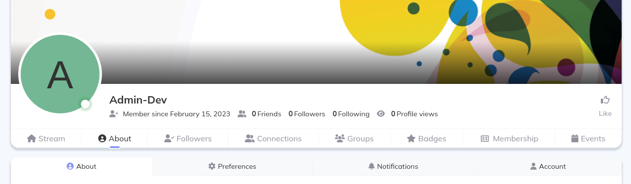
I was volunteering to help out with a WordPress site that uses Peepso (a plugin best described as a white-labelled Facebook), and user profiles have tab navigation that, among other things, include "Friends", "Photos", and "Videos". I was asked to hide "Photos" and "Videos", and change the text for "Friends" to "Connections". WordPress lets you inject custom CSS, which I figured was the least invasive way to solve this, and least likely to create future problems.
Problem
Hiding "Photos" and "Videos" was straightforward enough -- I put a display: none on the 6th and 7th nav items respectively (using the :nth-child() selector). But what about changing the "Friends" text?
Unfortunately, it's not wrapped in a span or similar, but rather is just a text node that looks like this:
<a href="..." class="ps-focus__menu-item ps-js-item">
	<i class="gcis gci-user-friends">
		::before
	</i>
	"Friends"
</a>
The <i> is the icon and "Friends" is just raw text. The only way we can influence that is with CSS that applies to the entire <a> element. And using the :after selector with a content: 'Connections' would only append the text at the end of "Friends".
Solution
After scratching my head a bit, I realised that there is a way to hide only the "Friends" text. You can set the font size of the <a> to 0, then reset it back to 1rem on the :after selector!
This is the final code:
/* Hide photos profile nav button */
#peepso-wrap div.ps-focus__menu-inner.ps-js-focus__menu-inner > a:nth-child(6) {
	display: none;
}

/* Hide videos profile nav button */
#peepso-wrap div.ps-focus__menu-inner.ps-js-focus__menu-inner > a:nth-child(7) {
	display: none;
}

/* Change "friends" to "connections" profile nav button */
#peepso-wrap div.ps-focus__menu-inner.ps-js-focus__menu-inner > a:nth-child(4) {
	font-size: 0;

}
#peepso-wrap div.ps-focus__menu-inner.ps-js-focus__menu-inner > a:nth-child(4) * {
	display: inline;
	font-size: 1rem;
}
#peepso-wrap div.ps-focus__menu-inner.ps-js-focus__menu-inner > a:nth-child(4):after {
	font-size: 1rem;
	content: 'Connections';
}

/* So icon and label are on top of each other for mobile */
@media (max-width: 46.24em) {
	#peepso-wrap div.ps-focus__menu-inner.ps-js-focus__menu-inner > a:nth-child(4) * {
		display: block;
		margin-bottom: 2px;
	}
}
I added a few more tweaks for mobile, et voilà!